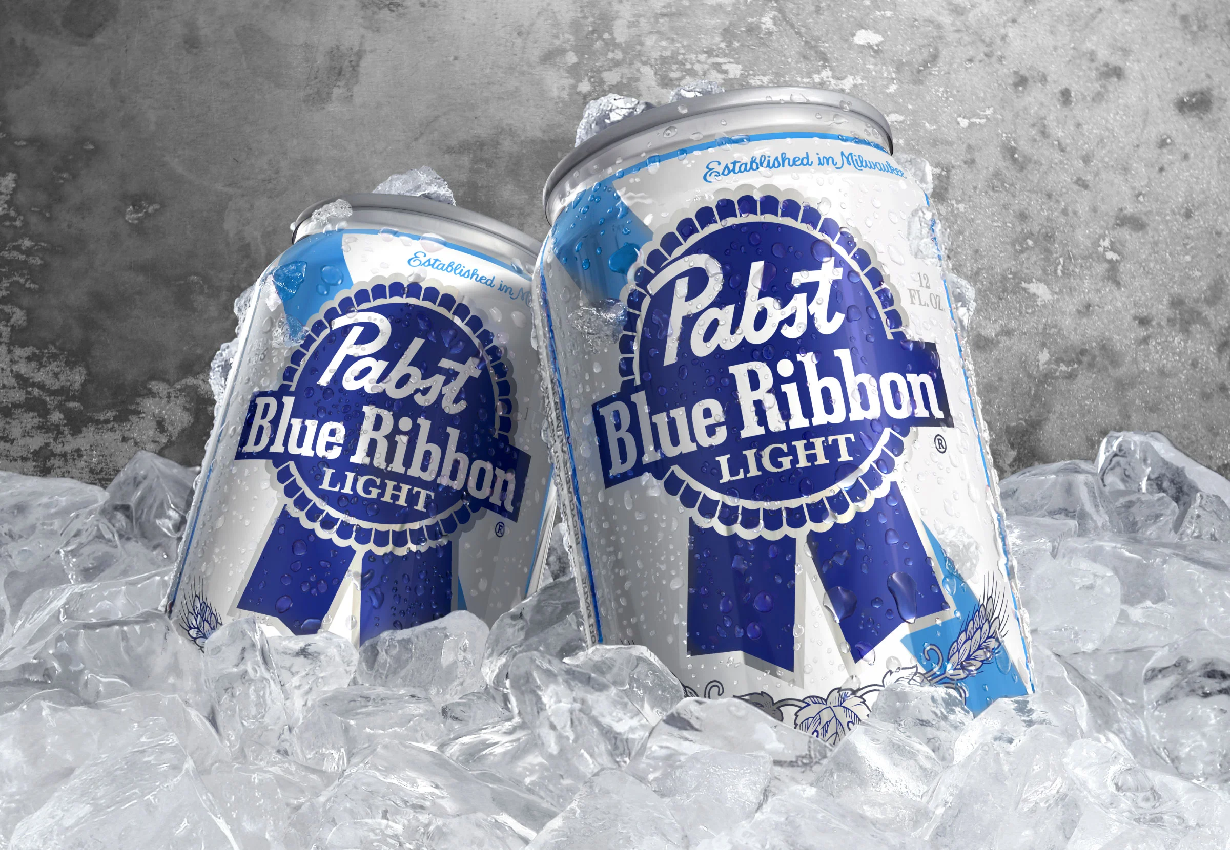
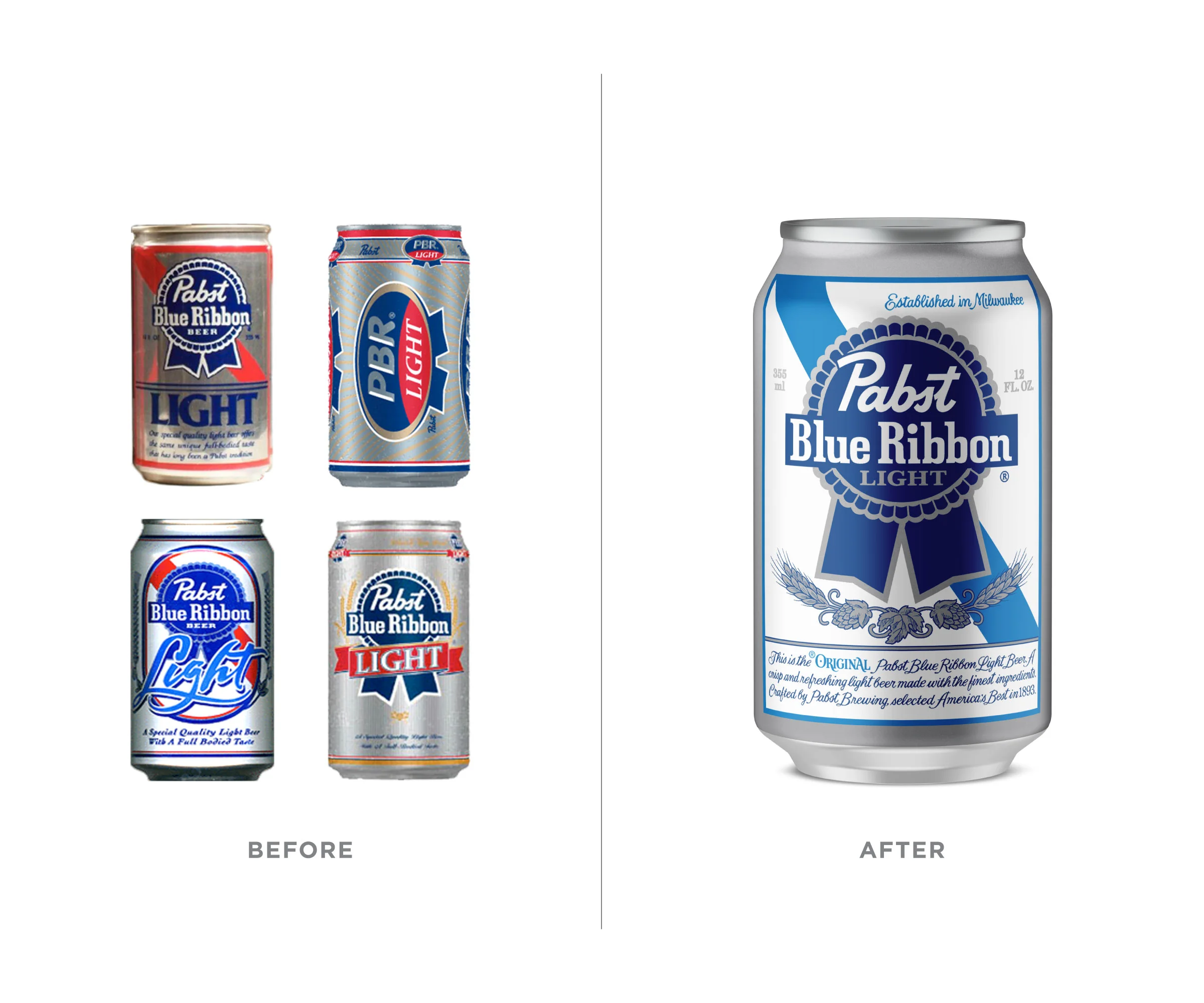
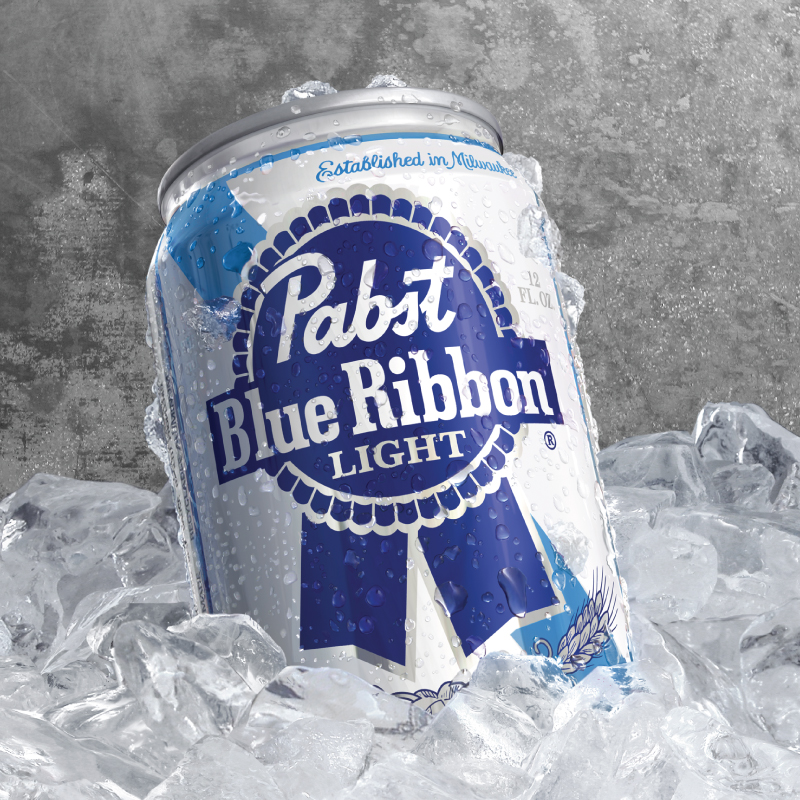
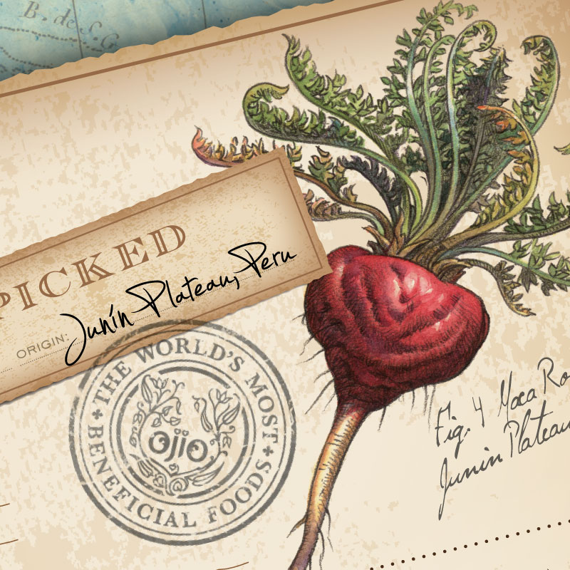
Pabst Blue Ribbon
- The light beer category was growing, but Pabst Blue Ribbon Light was not. At the time, the century old core brand was finding growth with a new generation attracted to its authentic heritage. Attempts to help PBR Light appeal to this new crowd fell flat, with designs that tried too hard to be “new.” By adopting the core brand’s trade dress and attitude — and visually unifying the brand — we present PBR Light as equally authentic.
PACKAGING, FLAVOR EXTENSION, RETAIL PACKS - Previous versions of PBR Light presented themselves as less than totally authentic by trying too hard to be the newest incarnation of Light Beer. Fortunately, we were able to grasp the pure essence of the brand and allow the Light flavor to adopt and extend the family heritage and trade dress without introducing new elements that had previously confused the clear connection. Now Light is as authentic as Regular and selling equally well.
- Separated at birth, these fraternal twins are now united as one family. An additional benefit of extending the brand essence to the Light flavor was also uniting the brands at shelf, expanding the Pabst section with a second flavor that is only slightly differentiated from the main, but sells the brand first and flavor differentiation secondarily.
- With PBR Light resolved, the brand was ready for its close-up. Because our in-house rendering capabilities were employed throughout the project, we were able to quickly create beauty-shot compositions that, once approved, we simply turned over to illustrator Matt Holmes to add condensation, ice, and a refreshing sense of reality.
- Extending to secondary items, it made sense to showcase the primary packaging as the “icon” of the brand. Although we prefer the sensibility shown in our first slide — flat graphics against worn galvanized siding — the hardcore competition in the convenience store cooler dictated a more conventional approach, and we were happy to help them meet expectations.


